The Arrogance & Influence of Alexey Brodovitch

Photographer Irving Penn had heard that his friend, mentor and father figure, Alexey Brodovitch, was on his deathbed. Years of drinking and chain smoking had caught up with the Russian aristocrat, and everyone believed he was down to his last days. However, when Penn arrived at the hospital for one last visit, he was met with another surprise.
“Thanks for sending me a copy of your book, but, frankly, I must tell you its terrible,” said Brodovitch from his hospital bed. Penn was startled. Would these really be the last words he would ever hear from Brodovitch? Would this be how he would remember the man who influenced and transformed his work, who made him the photographer he is today? Then it hit him. If the man was still filled with this much acid, he was surely going to be ok.
You see, Alexey Brodovitch, one of the greatest and most influential art directors of the 20th century, wasn’t known for his tenderness. He wasn’t known for being supportive. He wasn’t known for being a happy man.
Brodovitch was known for introducing America to European modernism and revolutionizing magazine design. He was known for exposing us to new talents such as Salvadore Dali and Herbert Bayer, and teaching great photographers such as Frank Roberts and Richard Avedon. He was known as the father of modern art direction, using unconventional and experimental designs that are common practice today. He was known for a lack of sympathy, decisive action, chain-smoking, and for being a drunk and a bit of a hard ass.
And the worlds of design, illustration, photography and art direction are better for it.
The work, inspiring. The man, frustrating.

“Astonish me.”
This was Alexey Brodovitch’s infamous catchphrase. He would direct this statement to not only his students, but to the legion of master photographers, designers and illustrators at his beck and call during his 24 years as the Art Director of Harper’s Bazaar.
And, after their receiving their masterpieces, he would take his scissors, cut up their work like a little girl making paper dolls, loosely tape the cropped Photostats to a page layout and leave it for someone else to clean up.
However, what Brodovitch lacked in charm and sobriety, his successor at Harper’s Bazaar, Henry Wolf, recounted that his colleague more than made up for in his skills. “He was great at communicating an idea, a mood, a criticism. In that he was precise and masterful.”
Brodovitch revolutionized American magazine design by introducing European modernism. Instead of adopting the conventional static layouts used in most magazines in the 1930s, Brodovitch broke the rules. He created double page layouts where text and imagery flowed like elegant poetry. Everything worked together to create visual storytelling that enhanced both the page and its contents. Each issue flowed like a musical composition, using changes in size, complexity, values and color to provide the viewer with a sequence of experiences, evoking energy and movement on the printed page.
His influence on the printed page can still be seen in today’s magazine layouts that, while no longer challenging convention, make use of different devices to tell their stories.
He congregated with starving artists. Then he stepped over Picasso on his way to the top.
After serving in the Russian Army during World War I and in the Russian Civil War, Brodovitch was exiled to Paris. An aristocrat, he found himself having to work for the first time in his life. He decided that if he had to work he’d follow his passion and become an artist. Albeit, a starving one.
Brodovitch soon found himself living in a cheap apartment in the Montparnasse neighborhood of Paris, an area teaming with some of the most influential artists of the 20th century. Here, he was exposed to a number of different styles, including Dadaism, Suprematism, Constructivism, Bauhaus and many more. Through these influences, Brodovitch found his beginnings as a designer.
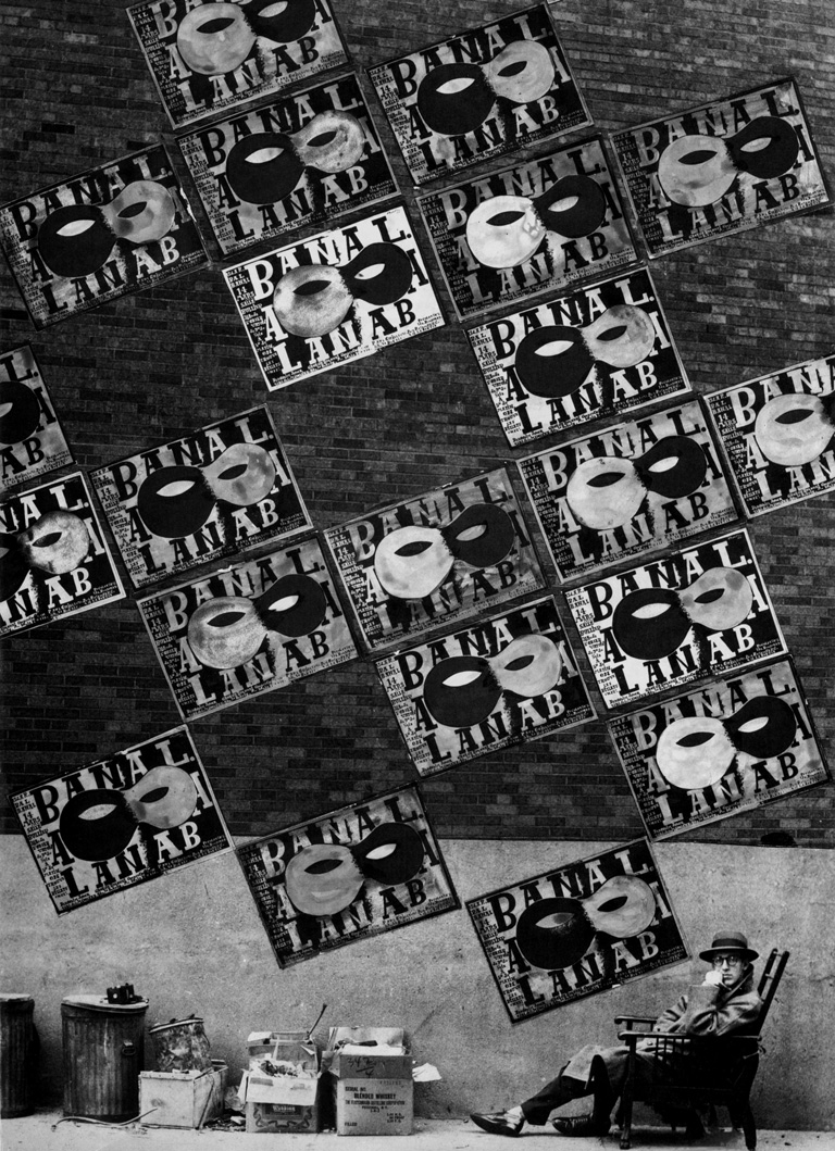
His big break came when he entered a poster contest for the Le Bal Banal, a charity ball for artists in the area. Many of France’s best and brightest entered; however, Brodovitch’s poster was proclaimed the winner, with a well-known artist by the name of Pablo Picasso coming in second.
With his poster featured on walls throughout the city, Brodovitch was soon in great demand, working for some of the biggest businesses in Paris at the time.
He used so much white space it was racist. Or at least a bit more refined.

Though extensive use of white space may seem like an Apple trademark, the team in Cupertino is actually taking inspiration from Alexey Brodovitch.
Before Brodovitch, art directors were infamous for crowding pages with text and imagery, then shading any areas of negative space. In stark contrast, Brodovitch used so much white space people joked that it was racist. Along with photos and text, white space was considered one of the primary elements of his design. By using more white space, he was able to create a greater sense of elegance and value. Clothes were no longer just clothes, but communicated a lifestyle, an experience and a brand.
Today, the use of white space is a best practice of design. His influence has since permeated magazines, advertisements, packaging and web design.
He contradicted himself a lot. But he always had a point.

Photographer and filmmaker, Jerry Schatzberg, fondly remembers taking a class with Brodovitch at the New School.
“He taught me something that I’ve always remembered: After we did the initial assignment, he contradicted what he said the first week, and I said, ‘Okay’. The next week, he contradicted what he said the second week. We went through 10 weeks of contradicting and I thought maybe he was drunk. At the end, he said, ‘You may think I’ve contradicted myself, but there’s no one way to do anything.’”
Though this statement reeks of arrogance and flakiness, Brodovitch’s career and design aesthetic back him up.
Brodovitch was a big proponent of experimentation and using different styles and influences. His experimental nature is what got him the job as the Art Director for Harper’s Bazaar and helped him transform the struggling magazine. Under his guidance Harper’s Bazaar was not only able to compete with its rival, Vogue, but define the New York fashion scene and post World War II photography in the US.
He was like your favorite teacher. You loved him and hated him in the same breath.
When Irving Penn and Alexey Brodovitch met for the last time it wasn’t in a hospital, but a small restaurant in Greenwich Village. Penn spoke of some long-range private experiments he was working on while Brodovitch, sick and on his way back to France, listened intently. His comprehension slipping, he told his friend, protégé and the man who was like a son to him, “I don’t understand what you are saying, Penn, but I believe in it.”
Brodovitch was like your favorite teacher, the one you loved to hate. It’s only later that you learn to appreciate how his lessons helped shape the person you have become. The lessons that Brodovitch shared through his own work and by teaching others have transformed and improved the worlds of photography, design, illustration and visual storytelling.
As Irving Penn put it, “All designers, all photographers, all art directors, whether they know it or not, are students of Alexey Brodovitch.”
Comments
Add A CommentYes Alex it is time your parents get some recognition for their Ava t garde forays into photography. I saw them myself those works in Housatonic. Stuart here. I said goodbye to Nick this past weekend
STRANGE THAT PENN AND AVEDON ARE THE GREAT RENAISSANCE STUDENTS OF ALEXEY BRODOVITCH, GENIUS, TRUE ARTIST, DARKROOM WIZARD, GENEROUS MASTER WITH A MAGIC EYE; HOWEVER TWO CHAIRS SIT BARE, WAITING WHILE BRODOVITCH WONDERS; WHERE IS PAUL AND KAREN RADKAI ?? mysteriously forgotten,derailed.....pourquoi??f