Redesigning LaCroix
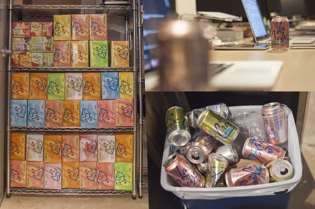
Coffee, gum and LaCroix: Nebo’s in-house bestsellers.
You’ll find them everywhere in our Atlanta office — shared fridges, conference rooms, dozens of boxes stacked sky-high in the pantry. There’s hardly a desk that doesn’t have that eyesore of a can displayed proudly and within arm’s reach. In fact, upon entering Nebo for the first time, you’ll probably be offered one along with a cup of coffee or glass of water.
Fortunately for LaCroix, and their parent company National Beverage Corporation, we aren’t the only ones who have found a place for them in our fridge and our fizzy little hearts. Without the help of traditional advertising, LaCroix’s sales have tripled over the past 8 years, earning them an estimated 30 percent market share. LaCroix’s Instagram and Facebook feed is filled with beautifully on-brand images of their fans interacting with their product — all shot, posted and hashtagged by the consumers, then picked up and re-posted by the LaCroix social media team. This lack of advertising, along with a dorky can and a no-frills healthy product, has gained the attention of the ever-elusive, “industry-killing” millennials.
As a marketer, they’re a case study in social media strategy and fan engagement. But as a designer, I’m sick of seeing these ugly cans everywhere.
I don’t wish failure on anyone, but I couldn’t help but think, what if the millennials went elsewhere? What if they “killed the water industry” with their fickle nature? What would happen to LaCroix if they suddenly had to rebrand and come up with something better to pull an audience?
I brought this up to our creative team and challenged each designer to explore a new visual direction for the brand. And I say visual, because none of us are food scientists, so we decided to stick with our expertise and just change the design. After all, there’s nothing wrong with the product itself.
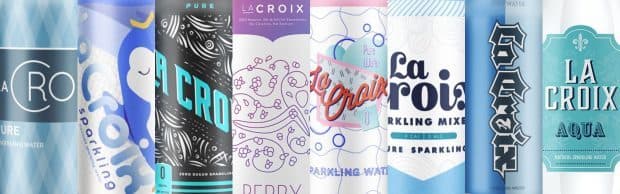
Here’s what we came up with:
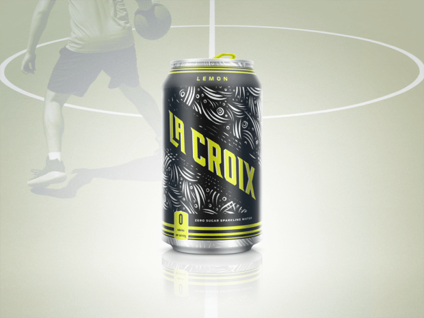
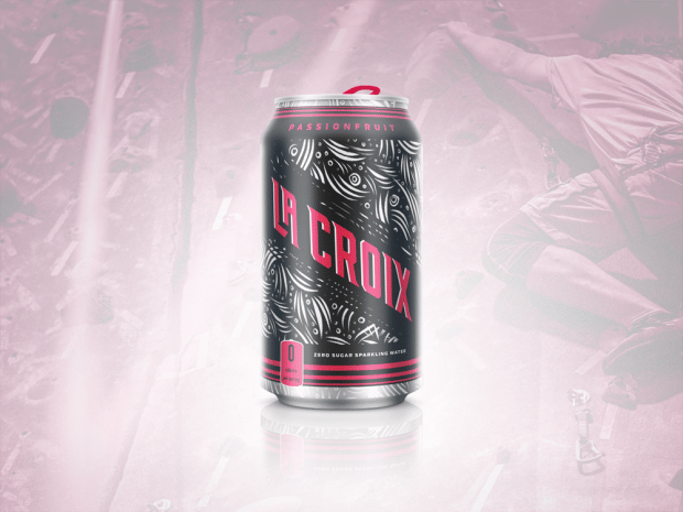
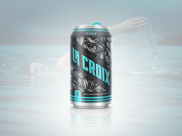
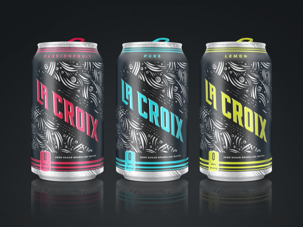
Gym Rat - Kory:
To speak to this audience, we reimagined LaCroix to be more sleek, modern and dynamic. A bold black and white swirl-and-bubble pattern covers the can to visualize the buzz of effervescent water, surrounding a new logo set in reverse italic that defies expectations, as do the athletes that strive for new personal records. Accented in an electric hue for each flavor, the can exudes rhythmic energy and makes finding your favorite flavor that much easier.
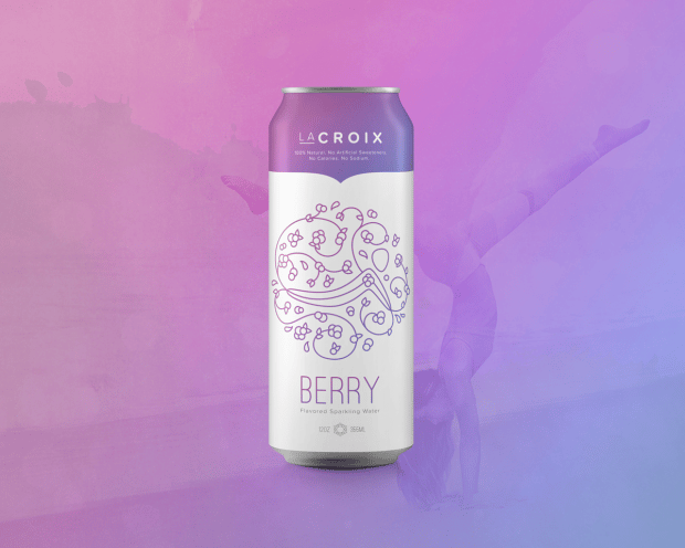
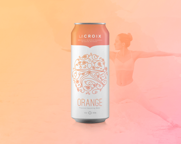
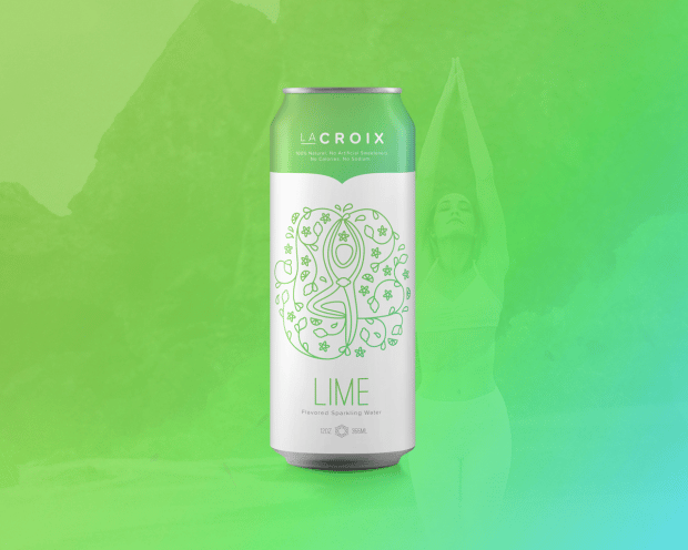
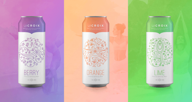
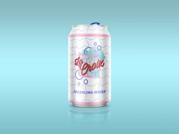
Healthy Active Female - Mathew:
Minimalist. Subtle. Beautiful. This taller and sleeker can fits easily in the hand and is great to grab on your way out the door. With soft fonts and feminine colors, this redesign is meant to entice healthy, active females who understand the importance of activity and hydration. Featuring an intricate design combining blossoms and abstract yoga poses, these cans emulate the connection of mind, body and spirit.
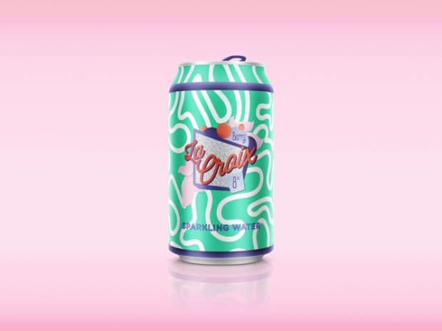
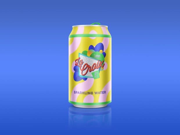
Middle Schooler - Carlos:
When you’re in middle school, nothing is more important than being cool. And nothing is cooler than LaCroix. With this design, LaCroix stands out among the simple, primary colored competition. Quirky shapes, a throwback 90s aesthetic and exciting pops of color ensure that preteens will be reaching for these 8oz cans in no time.
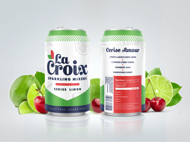
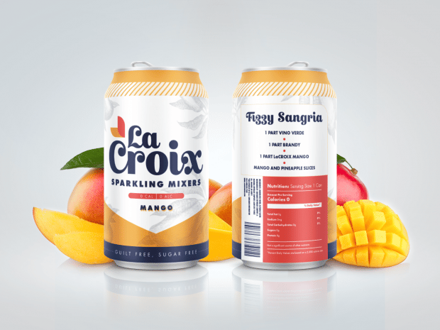
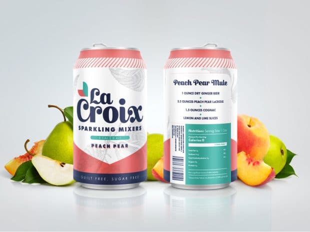
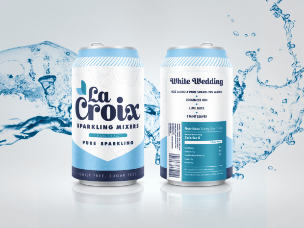
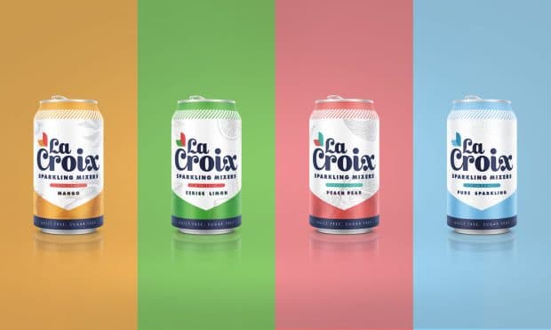
Bartender - Mo’:
Everyone is already mixing LaCroix into their cocktails, so why not make it official? This redesign is focused on bartenders, both professional and at home. With individual cocktail recipes on the back of each beverage, these babies aim to inspire and delight. This can is clean and sleek, while still using the original LaCroix colors. With stylized illustrations of the flavors, this design calls attention to the fruits used to make each one delicious. Though the brand isn’t actually French, the stylized font is a subtle nod to the entertaining confusion surrounding the product’s pronunciation.
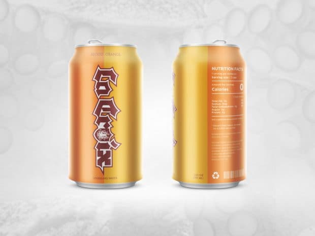
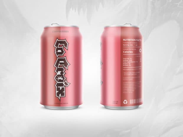
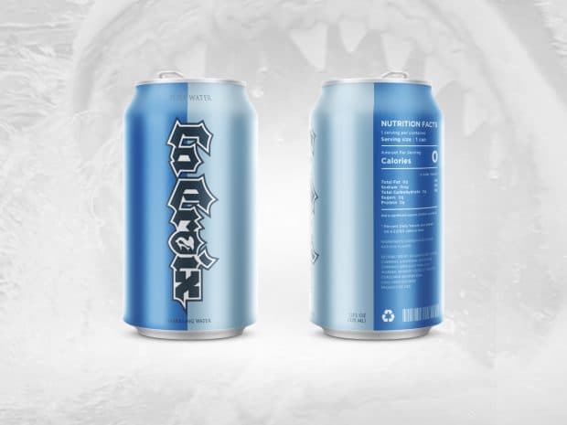
Gamer - Jake:
Earning the loyalty of gamers opens up doors to a $100 billion industry. LaCroix water gives gamers an alternative to sodas, letting them enjoy the beloved carbonation without a sugar rush, because it’s important to stay clear-headed during battle. With a strong, medieval type treatment and the two-tone color scheme reminiscent of ancient house banners, LaCroix transports drinkers to the realm of fantasy.
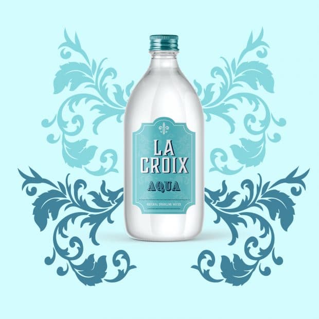
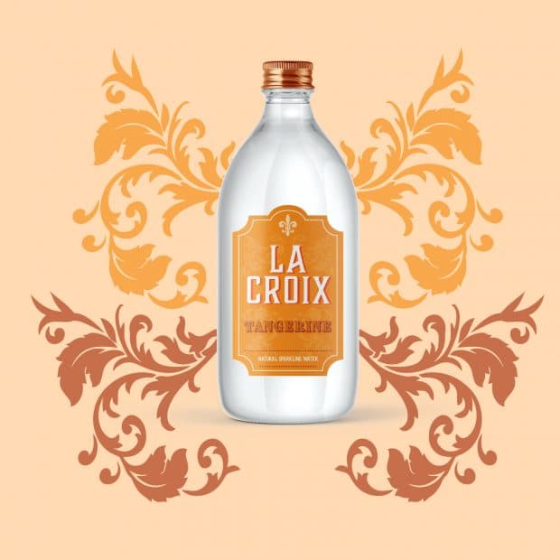
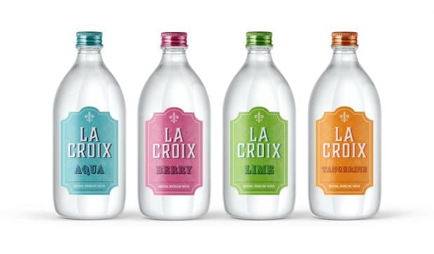
Water Snob - Owen:
This design doesn’t redesign the LaCroix can — it nixes it all together. Trading in the bulky can for a sleek glass bottle, this version of LaCroix (pronounced the French way) appeals to Pellegrino lovers who know there’s nothing more important than high-class hydration. With a resealable top and an aesthetically appealing design, these bottles are meant to be a visual focal point that can play a lead role at any dinner party. After all, you want everyone to know you drink fancy, bubbly, flavored water.
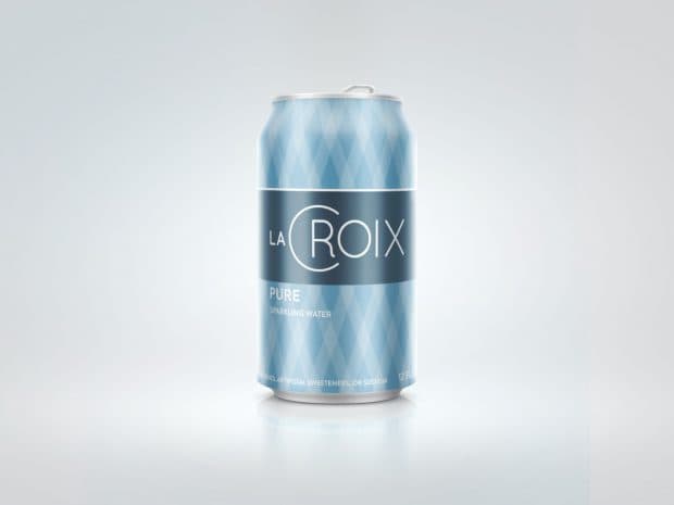
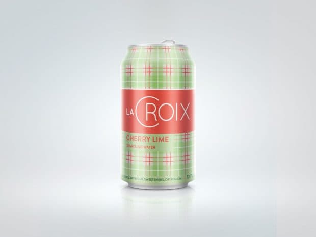
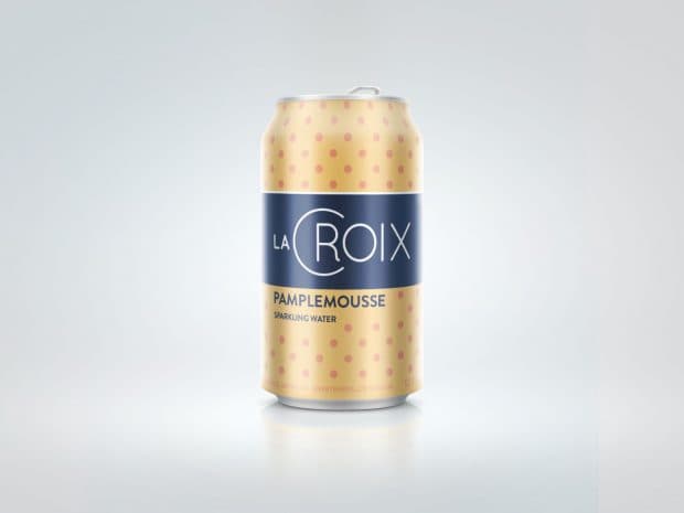
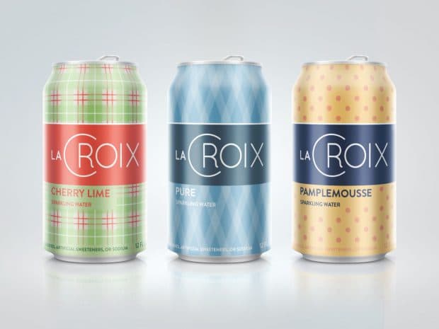
The Sartorialist - Pete:
Targeting suave, no-frills, no-nonsense bachelors, this design is classy and minimalist. The can’s patterning stems from men’s fashion, featuring argyles, plaids and the likes, with the color reflecting the product’s flavors. It screams sophistication.
So forget the LaCroix Boi, this drink is for gentlemen.
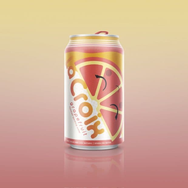
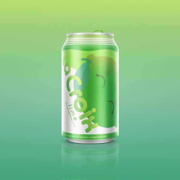
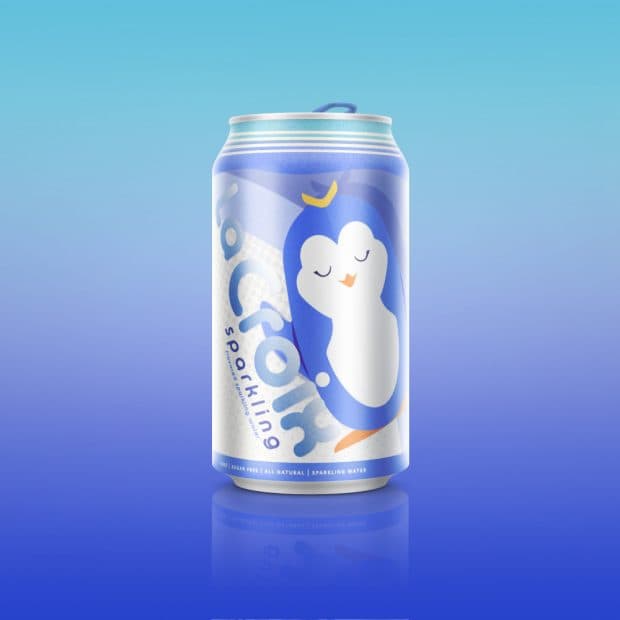
Elementary Schoolers - Venkat:
With zero calories and zero sugar, LaCroix sparkling water can be enjoyed by the whole family. That’s why this redesign focuses on a littler target audience: kindergartners. Each flavor has its own character displayed on the can, from happy, smiling fruits, to serene, sleeping penguins. Designed with flat art and colors, these cans are clean, bright, and fun to behold, which will encourage kids to stay healthy and hydrated.

Comments
Add A Commentdelicious drink, and most importantly non-alcoholic and well remove thirst
These are great! looks like a lot of hard work went into making these designs