Brace Yourselves, Google’s Mobile-First Index Is Coming

Arguably, we’re in the midst of the mobile age. Google says we’re moving into an AI-first world, beyond the mobile-first one. Mobile surpassed desktop back in 2015, and today, more than half of all Google searches are done on a mobile device. Over 60 percent of all searches came from mobile devices in 2016.
This means that now more than ever a strong mobile presence is critical for every business. Beyond Google’s algorithm updates, in terms of the shifting landscape of SEO and user experience mobile is where the action is.
Consequently, it’s a little surprising that they’re just now launching their mobile-first index (and that it keeps getting delayed).
What is Mobile-First Indexing?
On November 4, 2016, Google announced mobile-first indexing, wherein the mobile version of a website will be evaluated first for indexation and ranking. Historically, Google’s algorithm has looked to the desktop version of a website to evaluate relevance and authority. After the initial rollout, Google’s index will continue to be one single collection of pages and apps available. However, the key difference will be that in order to deliver users optimal content, Google will use the mobile version of a site’s content to rank pages from that site.
How to Prepare for Mobile-First
The best way to prepare for Google’s mobile-first index is with a responsive website. A website utilizing responsive design is built to serve all devices the same code (i.e., content) that simply adjusts for device screen size. Google has been very clear in stating that if your site is responsive and serves the same primary content across mobile and desktop, then you have nothing to fear from the mobile-first move. If you have a separate mobile version of your site (e.g., m.example.com) then Google recommends migrating your m. site to a responsive design before they migrate to the mobile-first index.
As if that’s not a strong enough proof point, Google representative John Mueller has said that regardless of the mobile-first index you should be migrating your site to a responsive design.

If Google’s goal is “to organize the world's information and make it universally accessible and useful,” it makes sense they advocate for responsive design. That’s the “accessible and useful” part in action. They are looking beyond relevance today and evaluating user experience across all devices. Google has said 61 percent of users are unlikely to return to a mobile site they had trouble accessing the first time. And, even worse, 40 percent of those users will visit a competitor’s site instead. Businesses need a mobile responsive site. Period.
And If Responsive Design Is Not Feasible?
If for some reason a shiny, new responsive website is simply not feasible for your business, there are mobile site considerations to evaluate in preparation for the mobile-first index.
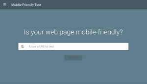
Mobile-Friendly Tool: Use Google’s Mobile-Friendly Test to evaluate the user experience for visitors on mobile devices. There is a stand-alone tool, but you should also ensure you have Google Search Console established for your domain in order to leverage the Mobile Usability report. This report provides a list of pages with mobile errors and potential usability issues. Even for websites that utilize responsive design, there may be issues that can easily be addressed such as clickable elements too close together or content and images larger than a mobile screen.
Irrelevant Redirects: One of the most common issues with mobile site configurations is faulty or irrelevant redirects. Faulty redirects may include a desktop URL redirecting smartphone users to an irrelevant page on the mobile version of the site. For example, www.MySite.com/work could redirect a smartphone user to m.MySite.com, rather than m.MySite.com/work. This type of irrelevant redirect not only leads to a poor user experience, but it also dilutes ranking signals for search engines following that redirect. Google has stated that best practices for redirecting smartphone users from a desktop URL are to send the user to the equivalent mobile-friendly page.

Errors & NOINDEX Directives: It is also a common occurrence for websites to serve a page to desktop users appropriately, while serving mobile users trying to access the same page a 404 error. This may be caused by a variety of reasons such as unplayable content or the lack of a mobile-friendly version of the page; however it’s important to identify any such issues and resolve the errors before the mobile-first index launches. The easiest way to do this is utilizing the Crawl Errors Report in Google Search Console and evaluating the Smartphone tab.

A few additional considerations and best practices to keep in mind:
- Verify the mobile version of your site in Search Console in addition to the desktop version.
- Once you have Search Console set up, submit the mobile site’s XML sitemap and ensure that you’re not blocking bots via the robots.txt file.
- Implement structured data markup on your site for both desktop and mobile.
- Ensure appropriate canonical tags and rel-annotations are in place to make it easier for search engines to understand the relationship between the pages.
- Avoid blocking resources such as JavaScript, CSS and image files.
- Ensure there is no unplayable content for mobile devices on your site.
- Avoid interstitials and overlays that not only create a poor user experience, but are now penalized by Google.
When Is This Happening?
As recently as March 2017, Google’s Gary Illyes said that the company is still experimenting with the mobile-first index and that a launch date is still months away. After initial reports that the mobile-first index would launch within months of the announcement, it’s now assumed that a launch is unlikely before 2018. That means that you have plenty of time to prepare…and that there’s no need freak out!
Evaluate the cost-benefit of migrating to a responsive design. There will never be a better time or reason to invest in your website. It will be worth your while to do so before the mobile-first index rolls out. If it’s just not possible anytime soon, optimize your mobile and desktop sites to ensure they provide the best user experience possible. Just remember: Google’s goal may be relevance, but user experience is the key driver of this shift.

Comments
Add A Comment