Walls Are the Windows to an Agency’s Soul
Nebo’s office space has an industrial look. Modern. Simple. It’s a restored warehouse that dates all the way back to the 1800s, which means it’s rich in history — and in design elements. There’s wood, brick, exposed metal and a few accent walls in white and blue. But with that coveted industrial-loft looks comes a lot of grey. The paint on the walls is grey. The concrete floors are grey. The concrete on the ceiling is also grey.
And Nebo is anything but grey. We’re a vibrant agency, complete with chili cookoffs, puppies and kickass work. Here on the design team, we kicked around some ideas about adding more color to the office. We wanted to add something with visual energy that could portray the things that make Nebo a great environment to work in.
So I made a mural.
It’s worth mentioning that I’d never done anything like this before. Like, not even close. Sure, I design stuff for clients all the time. But it’d been years since I painted anything, and I’d never painted anything of this size or prominence. And there’s no “undo” button on a paintbrush.
Intimidating, to say the least, but I sat down and started scratching out a design.
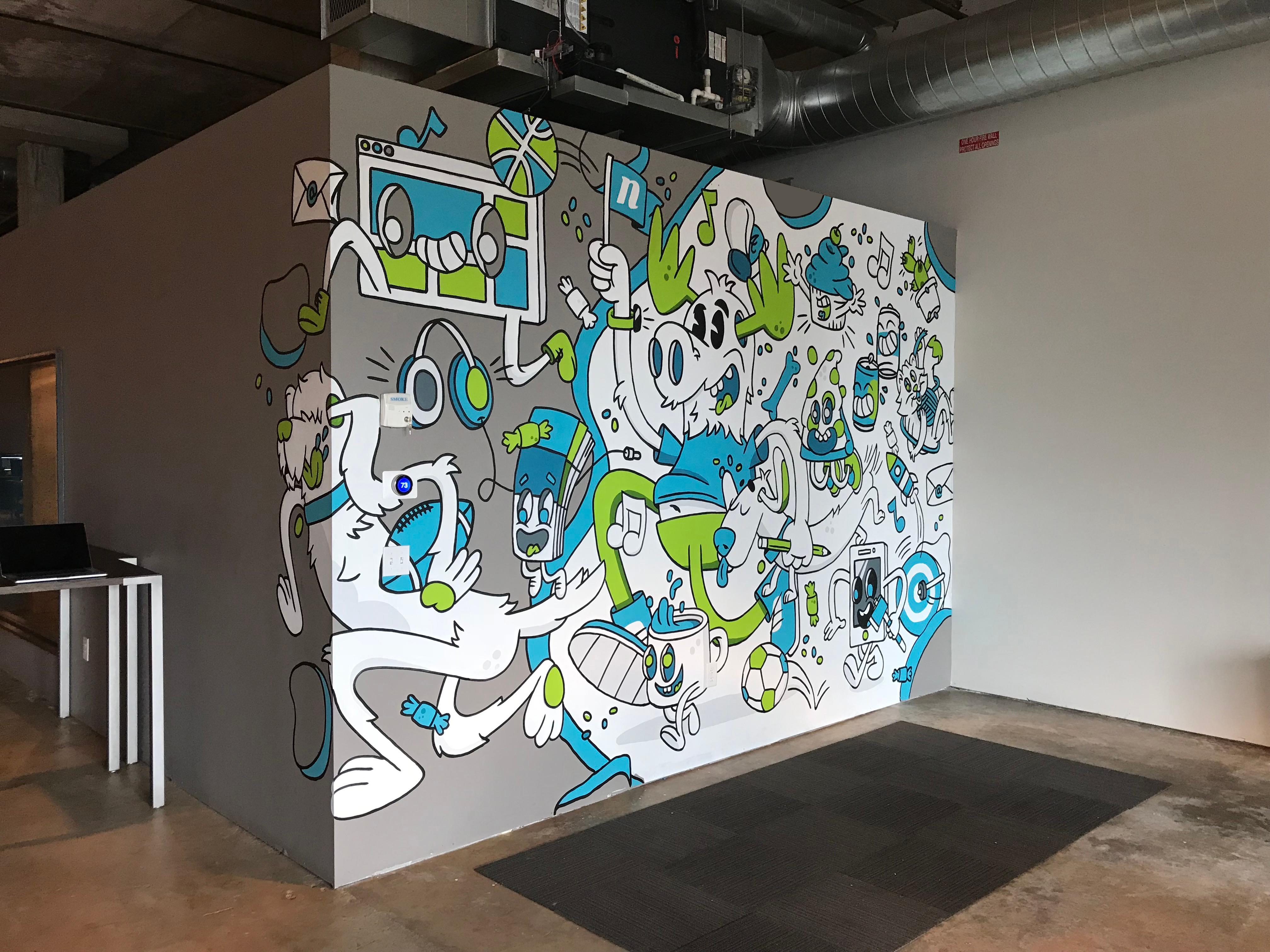
What makes Nebo great is the people. What makes the people great is our uniqueness, but also our shared love for experiences in and outside of the office — the dogs we bring in, events we attend, coffee dates, project launches, and everything in between. These are the things that I wanted the mural to reflect. I wanted it to be fun, whimsical and representative of our culture.
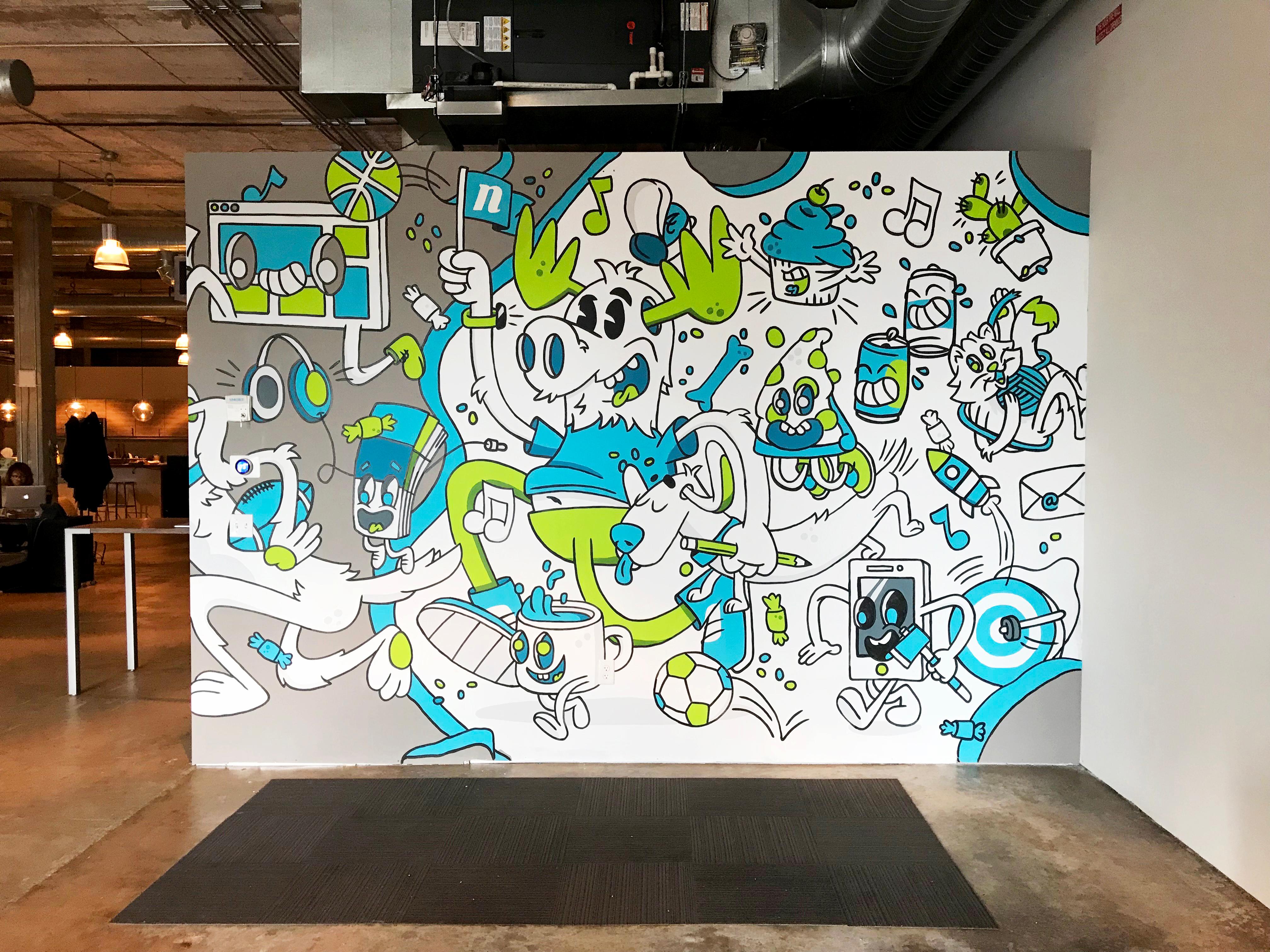
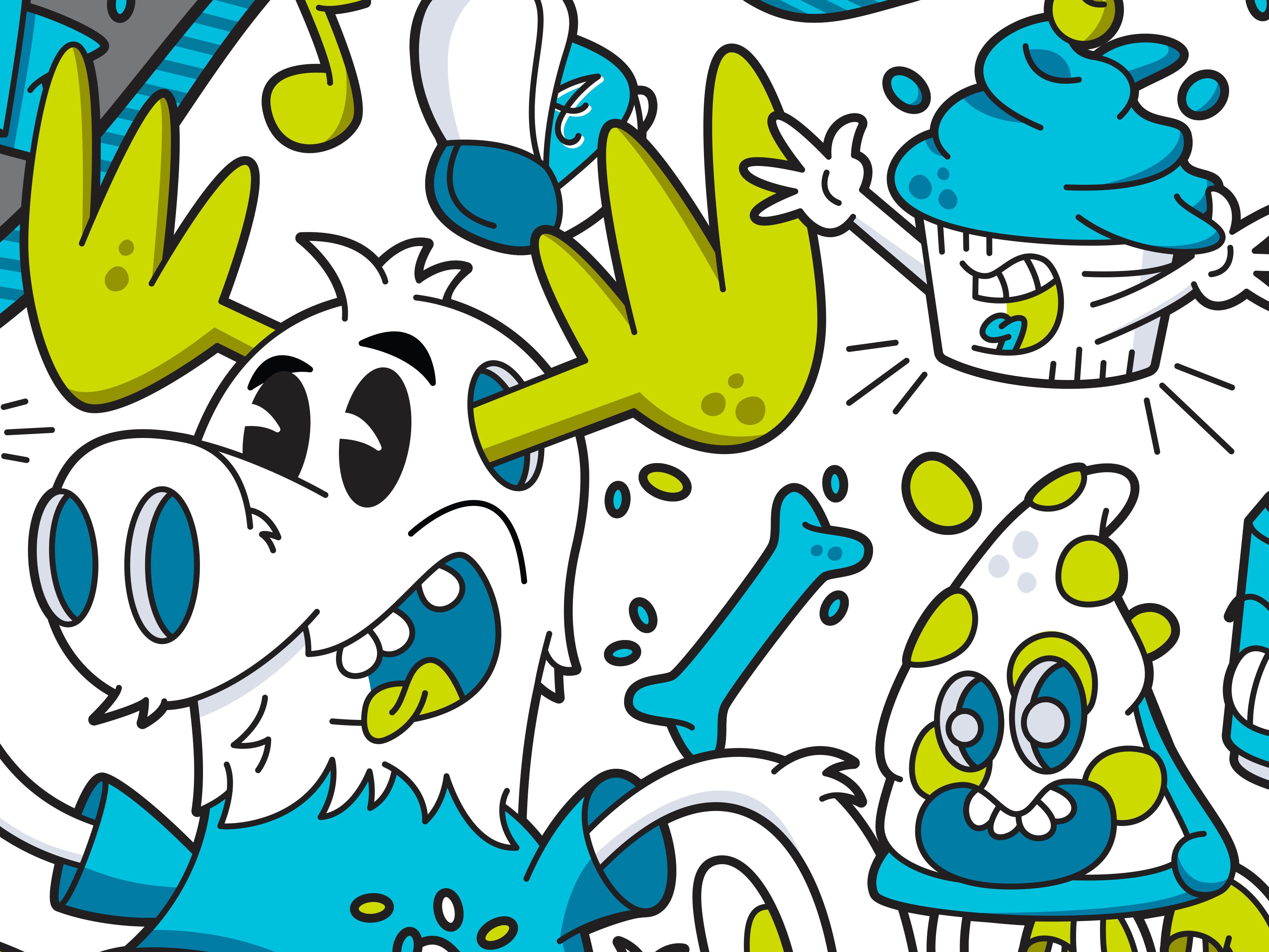
What I ended up with was basically a parade of all things Nebo. The centerpiece is a personification of our conference room, Moosehead. The room is named after Nebo’s unofficial mascot, a ceramic moose head that hangs above the head of the conference table.
Touting a Nebo flag in hand, the moose is surrounded by things that make us who we are. Cups of coffee, pups, music, sports, food and beers … oh, and I guess we do actually work too, so things like emails, browser windows and color swatch books are in there too.
Now the question was, where to put it? I wanted it to be seen. I wanted people to interact with it. I wanted it to bring a smile to employees, clients and office guests. Well, we have a huge, empty wall in the event space at the front of the office. So ... ¯\_(ツ)_/¯
With six gallons of paint, a paintbrush and a projector, I got to work. First, I set up the projector, making sure the image wasn’t skewed by the angle of the wall and floor. And then I turned that giant blank space into a massive paint-by-number projection.
Over the next five days, I jumped in and out of meetings, going back and forth between client work and painting. My approach was to first paint all the light blue parts, then all the light green parts, then the dark blue parts, and so on. Lastly, I finished it up with the black outline.
And, voila.
I’m happy to say that Nebo’s a little less grey now. And the de-greyification is only just beginning. My good buddy and fellow artiste Mo’ Safavynia has big plans for our even bigger back wall. We’re looking forward to unveiling that masterpiece in the future.
But for now, you can check out the evolution of the mural in this video. Make sure to turn the volume all the way up for the full Nebo experience (a.k.a., some tunes from a very sexy sax).
Comments
Add A CommentThe information you have posted is very useful. The sites you have referred was good. Thanks for sharing
Love the mural - it's really animated, fun and cute.
Also when reading this I thought:
And you know...
... grey is my favorite color
(and) I felt so symbolic yesterday. If I knew Picasso, I would find myself a grey guitar and play.
If I have to have this song in my head, you do too.