Finding Nebo: The Inside Story of Our Rebrand
When NeboWeb first started, we never went through a proper branding process. Client work came first and we never gave the brand identity the attention it deserved.
Our original logo was created on a whim after I traded a few emails with a designer named Walter Stevenson. He’d found a typeface for the “n” & “w” that I liked, and that mockup became our logo for the next 7 years. It was a great logo, but we felt like it was time for a change. The word “web” felt dated, and the old brand identity didn’t feel like us anymore.
So in 2010, we decided to rebrand.
The Name We Almost Had
When we originally started down the path of our rebrand, we focused on choosing an entirely new name. If we were going to rebrand, we wanted to go all the way. The goal was to come up with a new name that represented who we were seeking to become, not who we had been in the past.
Our team spent hours listing potential brand names and brainstorming possibilities, checking for domains, and searching for potential conflicts. This exercise resulted in over 100 potential brand names.
Next, we created a shortlist of the top 5 favorite names:
- Museo: A place of inspiration. Where muses gather.
- Komodo: Like the dragon. Strong and tough.
- Brigade of Thinkers: A jolly group of marketing pirates.
- Pollen: We create ideas that spread.
- Von Von: Pure nonsense.
We put together a web-based survey and sent it out to our team asking them to choose our new name. The results came in. The winner was Museo.
For six weeks we explored the idea of rebranding to Museo, going so far as to work up logo concepts.
But something didn’t feel right.
We decided to pause the project and revisit our decision.
A Completely Different Direction
The team had a few concerns with the name Museo. Some didn’t want to completely lose the brand equity we’d developed with NeboWeb. Others said the logo just didn’t feel right. And we were all concerned about the fact that Museo in Spanish & Italian translated into “museum.” This wouldn’t be a big deal for native English speakers, but for multilingual people it made the brand seem generic.
So after some gnashing of teeth and a lot of cursing, we went back to the drawing board.
An Evolution, Not a Revolution
We decided to revisit a name we’d previously discarded. It was a simpler and more elegant evolution of the NeboWeb name. The term “web” felt dated and unnecessary. So we killed it. That left us with NEBO.
NEBO had a few key advantages. Many of our clients already called us by that name. It was short and easy to remember. And it didn’t have any meaning in any major languages (other than Assyrian – where Nebo is the name of the god of wisdom).
Now we had to bring NEBO to life.
Casey Britt, the lead art director on the project, started sketching up concepts. He developed page after page of potential logos. After six weeks, we eventually narrowed them down to the finalists.
The Finalists
At this point, we started treating the rebrand like a project we would do for our clients. We created a presentation to show the potential new brand directions to our internal team and stakeholders.
We presented the following directions:
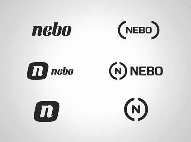
After the presentation, the decision was quick and rather unanimous. Everyone really liked the custom typeface. They felt it was more aligned to our personality than the other option. It was more friendly and inviting than the half circles.
Finally, we’d selected a logo and were getting somewhere.
Choosing Colors
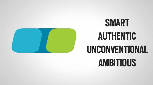
Our initial instinct was to keep red as the primary brand color. However, during our competitive research we noticed that red had become a default color for many digital agency logos.
After exploring our options, we decided to do something different.
The Final Outcome
We finally had a new logo and a color palette. The hard work now behind us, we started on the final deliverables.
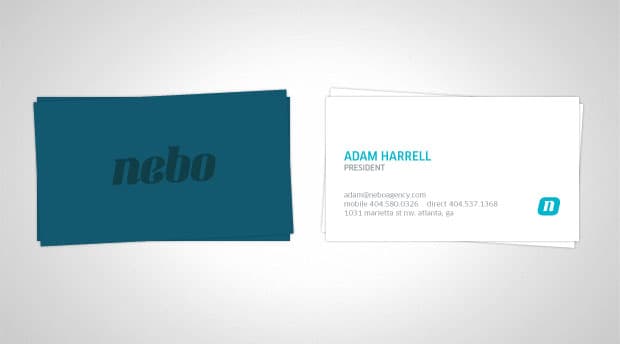
In less than a month we designed new cards and letterhead. Our old cards were custom sized digital print jobs with some spot-UV finishes. They were unique, but didn’t embody the right feel or quality. We wanted something with a bit more old-world craftsmanship, so we contacted a letterpress shop and started talking through our ideas. We ended up choosing a two-sided sandwiched paper card with letterpress type & logo, as well as painted edges. It was a card that even Patrick Bateman would be impressed with.
After the cards were done, we started work on the new website. We knew we wanted something that didn’t feel as dated as our old site (which at the time was 5 years old).
The goal was to create a website that made clients want to partner with us on new projects and potential employees excited about the possibility of working with Nebo.
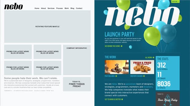
The idea of a magazine–style layout was the first thing that came to mind. Our logo looked really nice in a large size, and we wanted to bring a traditional printed page structure to the new site design. Casey worked up a sketch of the layout, while I mocked up some quick wireframes. We loved the homepage sketch. From there, Casey moved into Photoshop and started pushing pixels.
In less than a week, we’d pulled together our new homepage:
After the website was designed, we tackled all of the other brand identity pieces. From exterior signage (still under construction), to new team photos, PowerPoint templates and sales proposals (still in process).
Shiny, Happy & New
Overall, the project took a full year to complete. We could only work on it during downtime, so it took longer than we expected.
The biggest thing we learned during the rebrand was to embrace the opportunity for change and avoid settling for “good enough.” When our brand felt old, we decided to rebrand. When Museo wasn’t turning out as we had hoped, we trashed it and went back to the drawing board.
But when we finally found something that worked, we never looked back.
Thank you to the entire Nebo team for all of the hard work you put into this project. You guys are amazing. Brian & I can’t thank you enough.
To the rest of you out there, I hope you enjoyed this behind the scenes look at the process of rebranding our company. If you have any questions or comments, feel free to leave them below.

Comments
Add A Comment@Sam you're welcome. I'm glad you enjoyed the story.
Thanks for sharing that story. It gives a great sense of the process and what it takes to go through this. It is not as easy as many people think. We are going through the same steps now. Thanks again.
Thanks! Glad you like it.
Very interesting read! I hadn't seen your older website but I love the boldness and simplicity of your current. Very modern and inviting. Great work.
Love the biz card reference to American Pyshco. LOOKS GREAT!
I love the new website - while I really did enjoy the old one , the new one - is well, new and clean and professional looking , Thank you for everything you have done for The Arc - there is no way we would have been able to experience the growth that we have over the last couple of years without your help
Love the new site & brand. It's a great compliment to a great group of people.
Great stuff guys - I love seeing everyone there being so successful and not only mastering trends, but innovating and creating them. Good luck to Nebo!
The new site looks great guys, good work!
Looks great! Congratulations to you and your team.
Love the new colors. Best of luck going forward!
Nice work Nebo team! Looks great!
Thanks holt!
Nice work, Nebo!