Email for All

Sometimes, the most exciting projects are — surprisingly — the easiest. At least, that was the case for our most recent endeavor here on the Nebo email team: creating email accessibility standards.
Wait, that can’t be right! you say. Accessibility means more code, more thought about design and copy, more time spent considering what it’d be like to need accessible email. How could all of that be easy? The answer: most of what ended up in our accessibility standards was stuff we were already doing.
That’s because accessibility isn’t some strange new frontier. It’s a continuation of making content that puts people first by ensuring they can access it in the best way possible.
Defining the Issue
A few weeks ago, we wrote a blog about making digital experiences more accessible for everyone. But what does that mean for email?
At its core, email accessibility means making content that those with disabilities can interact with at the same level as someone without a disability. That could mean making sure the design is easy to view and navigate for people with vision problems, adding a bit of code for the benefit of screen-reading devices or making interactive content large enough to easily be clicked on.
Over the past few years, content on the web has become more accessible, while at the same time inviting more scrutiny from activists when businesses aren’t ADA compliant. Accessibility for email is having its long overdue moment as well, as more marketers and email developers look to bring the same standards to your inbox.
Unfortunately though, there are a lot of marketers who want to make accessibility standards, while few who are following through. In a survey by Litmus, 77% of brands want to have accessibility standards, yet only 8% of those surveyed say they follow best practices.
This is unfortunate since world wide about 15% of the population has at least one disability according to the WHO. Of those people, roughly 285 million have a visual impairment, which means 285 million people might have a hard time viewing your email if it’s not accessibly designed.
But accessibility isn’t limited to vision. Accessible email also serves those with physical and cognitive limitations that range from temporary, like a broken wrist, to lifelong, like cerebral palsy. There’s no end to the number of combinations of different limitations someone might have to overcome.
It’s worth mentioning here that when we talk about accessibility standards for marketing it can feel like marketers are only doing it to boost their audience or avoid being called out for not doing it. But any decent email marketer is already making sure to only target consumers who have said, “Yes, I want this content in my inbox.” Individuals with disabilities are the same as any consumer group. They have wants and needs and things they want to buy. By not allowing them to access the content you’re sending, you are denying them those very human experiences.
How Did We Do It?
You don’t have to be an expert on every disability or assistive tool to create your accessibility standards. At Nebo, one of the first things we did was explore ways to experience having a disability and the impact that may have on how we read email. You can do this by turning on VoiceOver and letting it read through your emails.
If this was the way you interacted with the email, are you still getting the most out of it? Does it convey all the information, both text and images, in the same way as reading through it yourself? What if you had to navigate through the content using only the Tab key?
Our phones have a host of accessibility options that can be turned on and experimented with as well. This can be a good exercise to go beyond the inbox and see where else accessibility can make a difference in how users perceive content and the challenges they might face.
For instance, if you bump up the size of the text, it’ll be easier to see but also take up more space, which could alter the layout or force you to scroll more than you’d like to. This could be even more of an issue if you have a disability like dyspraxia that makes fine motor control difficult. So the solution could be to reduce the amount of copy over all, something we’ll later see is a recommended best practice.
When creating emails for accessibility, there are a lot of intersecting potential issues to consider. The solution is almost never just a design or code consideration, but a combination of all the elements of email.
Bringing It All Together
Once we had an understanding of who we were designing for, it was time to put together the standards. While there are no universal standards for email accessibility, there are some we could work off of. However, by making our own standards, we ensured that every rule on them was something we understood and knew was applicable to us and our clients. Each line item became more than a checkbox.
One of the most important accessibility standards, and an excellent place to start for guidance, is the Web Content Accessibility Guidelines (WCAG) 2.1, which covers all digital content including email. These guidelines have been in continual development by the W3C since 1995. For something a little easier to digest, the US Department of Health and Human Services has created an email specific checklist.
We ended up basing our own standards on the WCAG 2.1 guidelines while taking into consideration the type of emails we send and the industries our clients are in.
What Are the Standards?
Without getting too technical, we wanted to share an overview of our standards and include what every marketer should be able to add to their emails today.
-
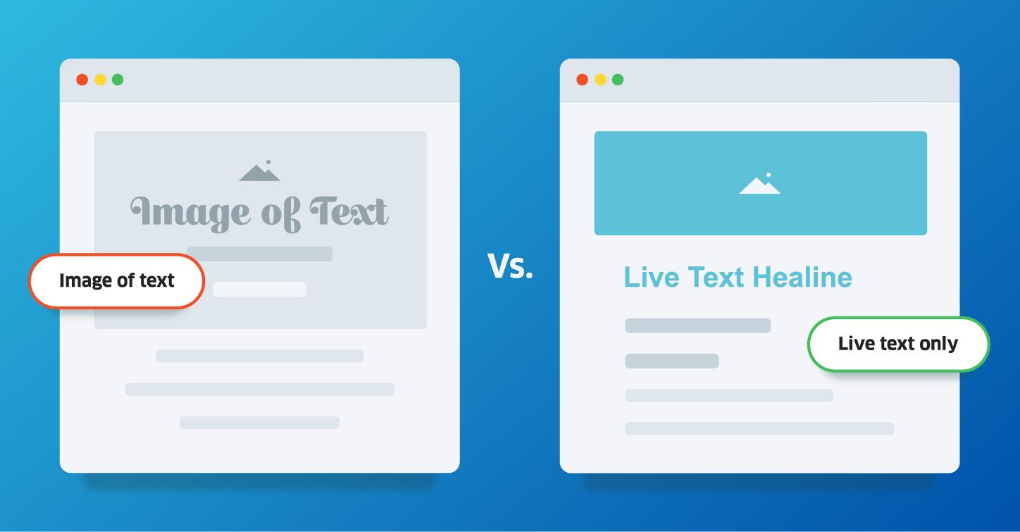
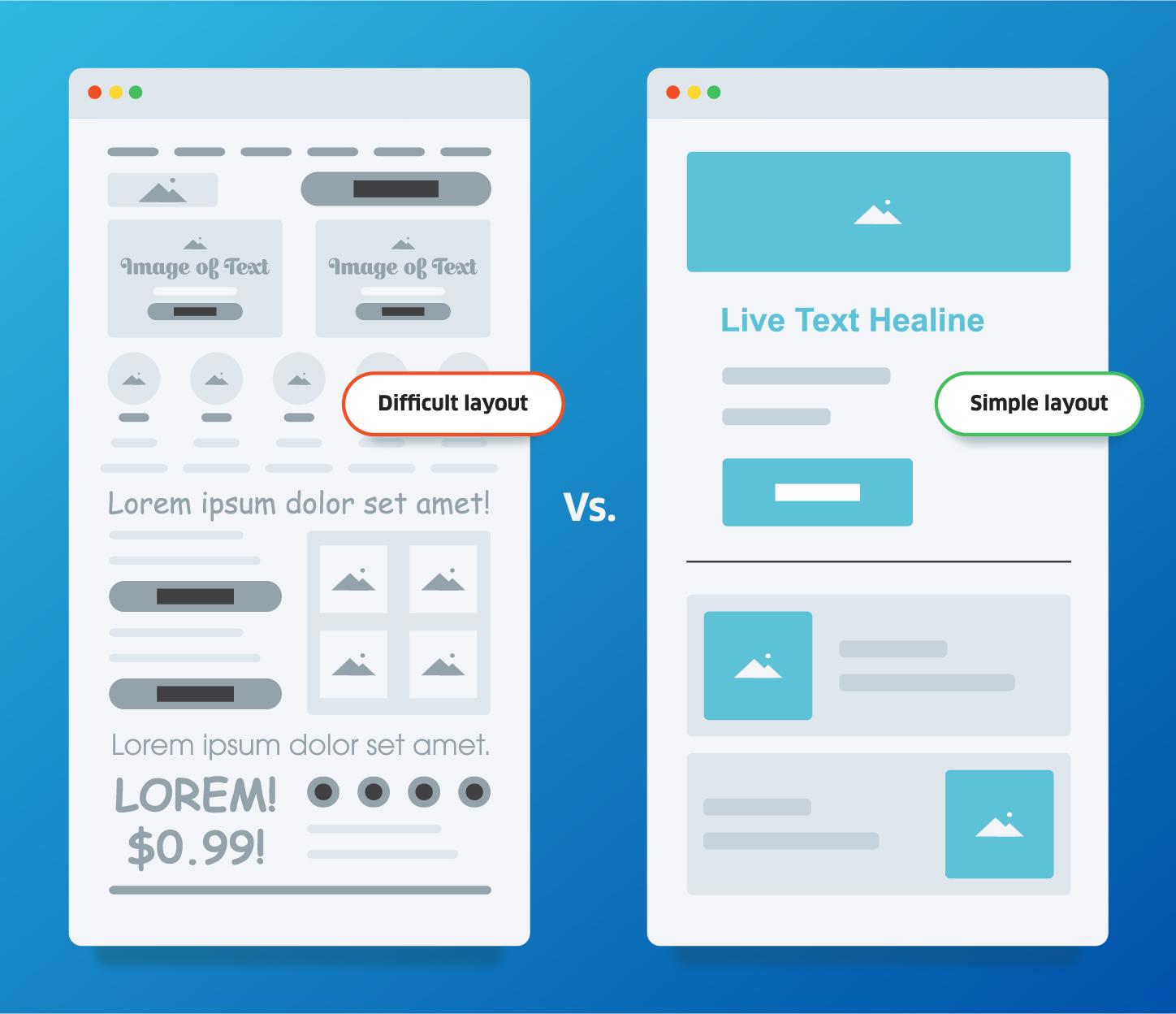
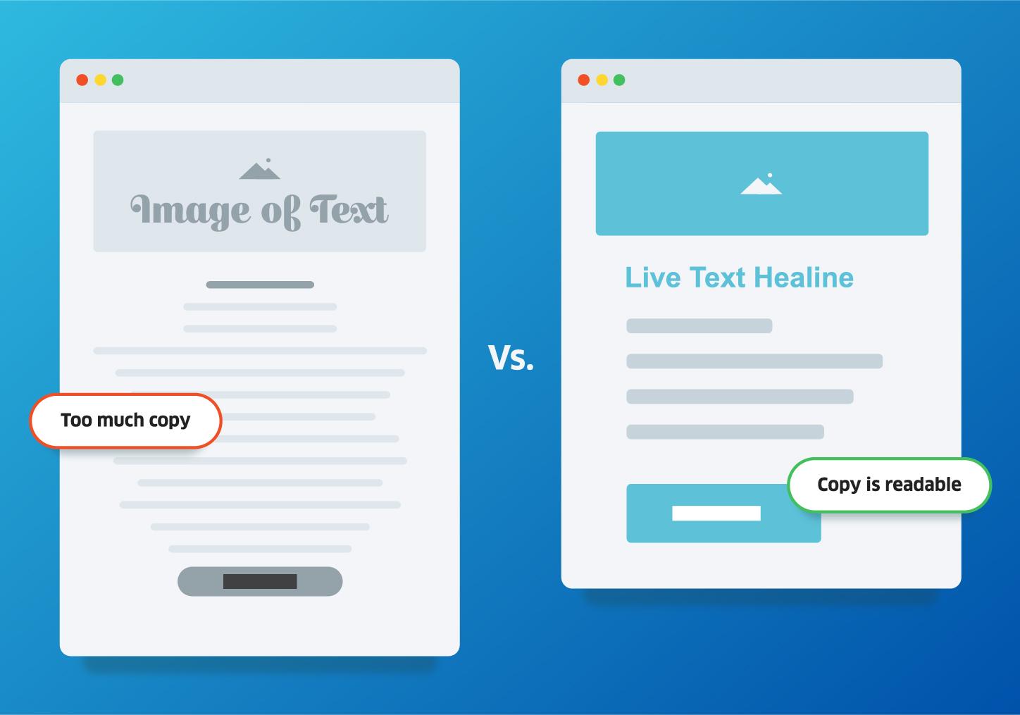
Live text only, no images of text. This makes it easier for screen readers to parse the content and ensures no content is missing if the images fail to load or can’t be seen.
-
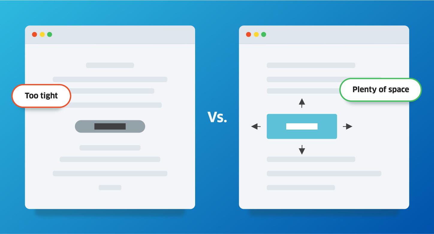
All interactive content is large enough and has enough space around it to ensure it’s easy to identify and click.
-
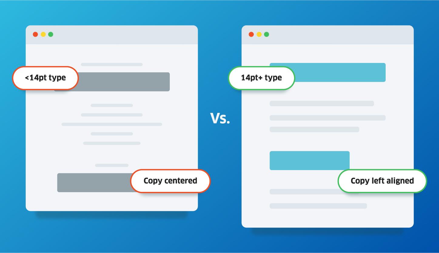
Text should be a minimum 14 pt and left aligned to make it easy to read and follow from line to line.
-
Alt text for all images displaying relevant content
-
Keep the layout simple. Make sure the content is easy to navigate for people using assitive technology to sequentially go from one element to the next.
-
Include markup for screen readers
-
Copy is readable, aim for 50 words and use of simple words
-
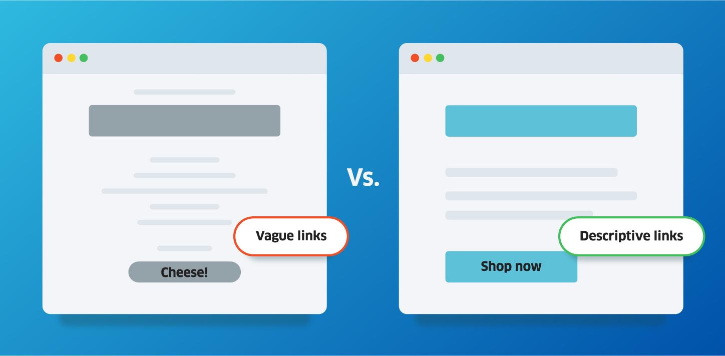
Links are descriptive about where they take the user
-
Test emails on multiple devices to make sure they all perform the same way
-
Revise, our standards are never final. We can always improve.
Looking Forward
In the end, creating email accessibility standards wasn’t a huge overhaul. It was a little research and elbow grease that we hope will go a long way toward making the emails we create more available to everyone.
One day, we’ll review these standards and realize they’re no longer good enough. And we’re excited for that day, when accessibility is making great strides — even if that means we have to strive to keep up.

Comments
Add A CommentThis is a great article. It gave me a lot of useful information. thank you very much.