Shaping an Iconic Brand’s Mobile Shopping Experience
Aligning Function and Form
Spanx approached Nebo with a desire to increase mobile purchases by 30%. They were in the midst of expanding product offerings and brand positioning to go beyond shapewear, which meant their mobile and desktop shopping experience needed to be as smooth as possible.
Solving the Problem
We worked with Spanx’s internal engineering, design and content teams to understand background, future plans and capabilities so we could right-size our recommendations.
To understand the situation better, we evaluated Spanx’s shopping experience on mobile and desktop, along with experiences of industry peers. Our team also relied heavily on user research, including heatmapping, session recording and customer feedback tools. Synthesizing qualitative and quantitative data with usability best practices, Nebo assembled an extensive tactical plan with specific, implementable improvements for Spanx.com.
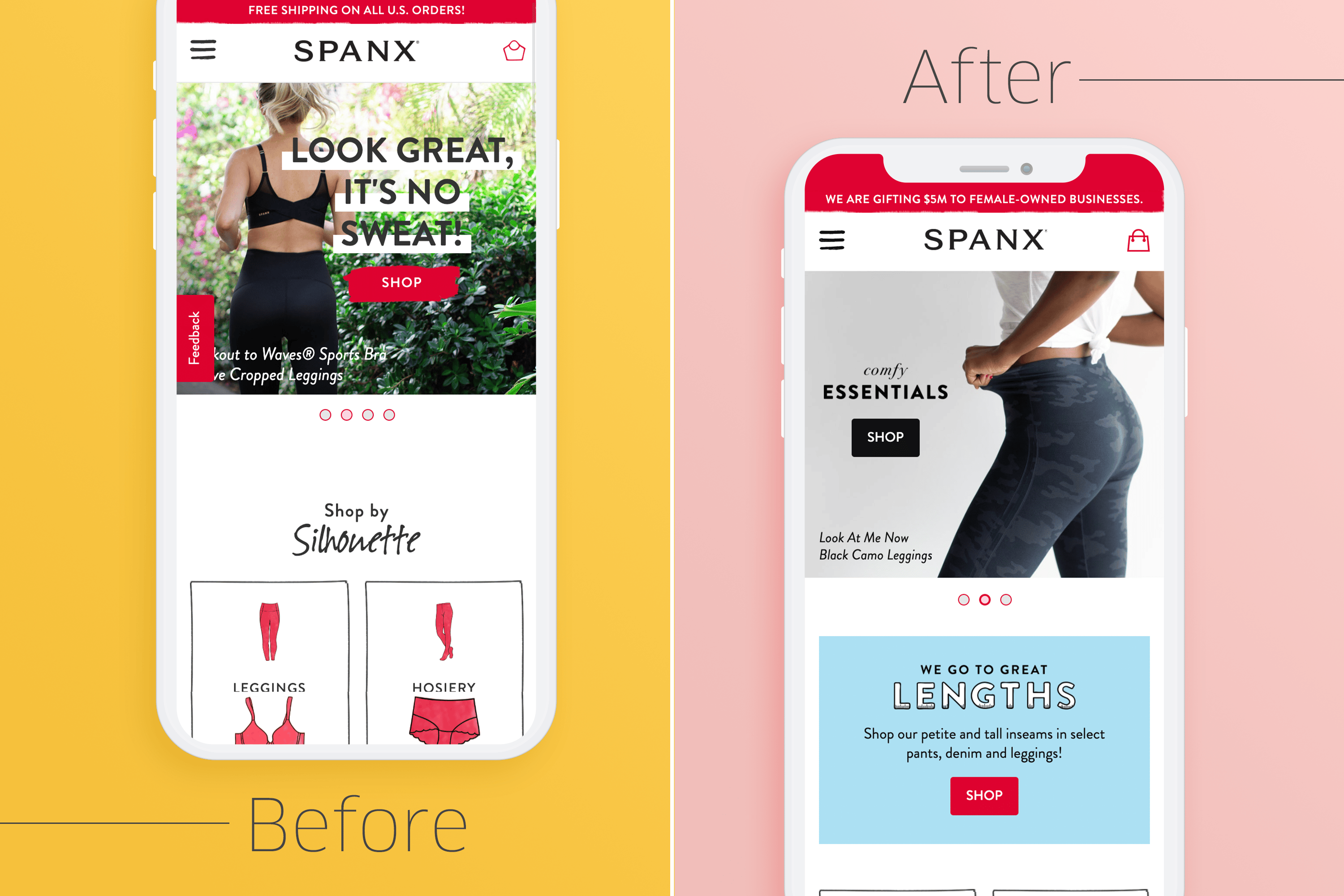
- Better defined CTAs from a visual standpoint sitewide
- Removed ambiguity in navigation design elements
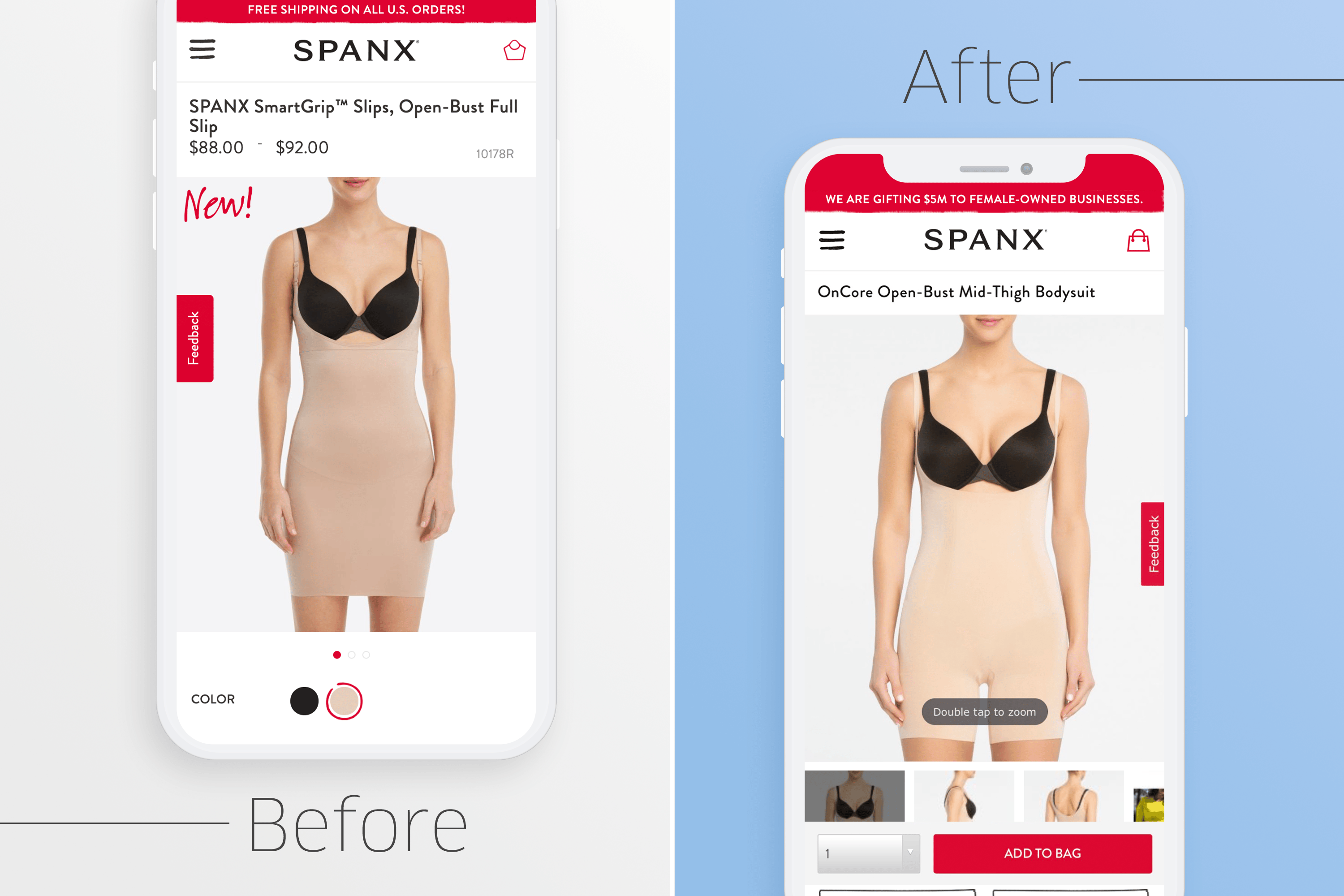
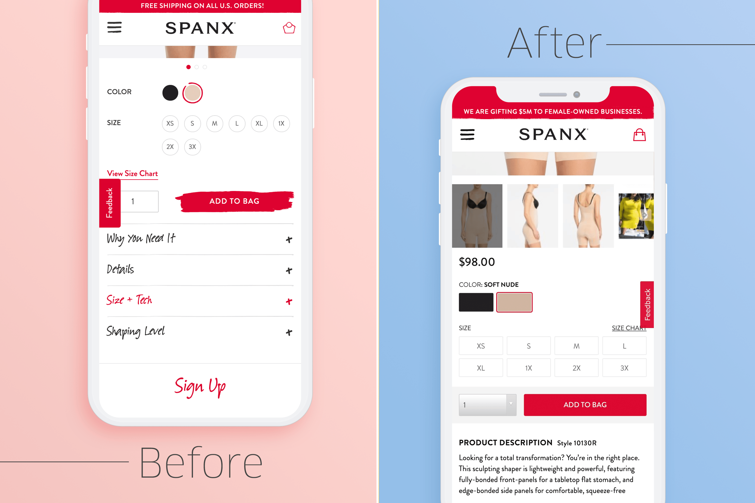
- Improved product pages from the ground up: made product specs easier to find, added clarity around sizing and shape level, displayed color selection more prominently
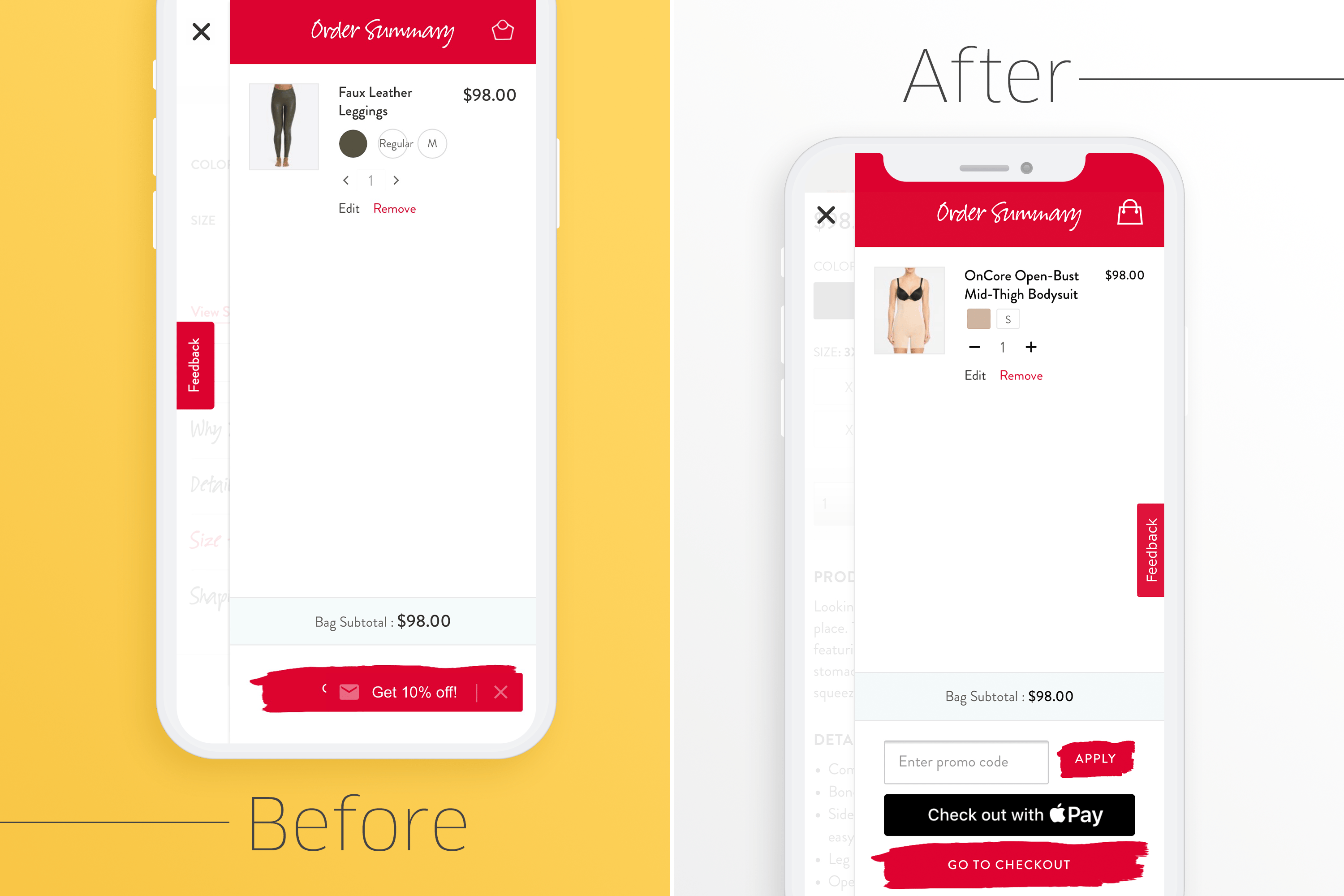
- Created a seamless checkout experience and optimized forms
- Made image selections more helpful with zoom feature
Results
Nebo equipped Spanx with the tools they needed to accentuate their mobile shopping experience in all the right places. We brought blind spots to their attention, helped them reach consensus among stakeholders and defined additional areas for improvement from a technical standpoint.
You can see Nebo’s recommendations on Spanx.com today, with more updates likely to roll out in the future.


