The Great UX Balancing Act Between the Memorable and the Forgettable

Working in UX means I spend a lot of time interacting with digital experiences. Between work and everyday life, I’m constantly navigating websites, testing product flows, QA’ing forms, using dashboards and moving through apps — all day long. Most of these experiences work perfectly fine. But when I stop to think about the interactions that actually stay with me afterward, I realize how few individual moments truly stand out in my memory.
I don’t remember most checkout flows, contact forms, account settings panels or password resets. But I do remember the support interaction in Figma that saved me when I accidentally deleted an entire project folder. I remember exploring the Salesforce navigation system and realizing it completely changed the way I thought about structuring enterprise experiences. And I definitely remember the Amazon Prime cancellation flow that felt strangely long and manipulative.
Flows Versus Feeling
Maybe that’s the designer in me talking. I naturally categorize experiences into onboarding flows, navigation systems, support journeys and conversion paths because that’s how I think about experiences professionally. But when I stop looking at those experiences through a designer lens and start thinking about how normal everyday users experience them, I realize it isn’t really the flows themselves I remember most — it’s the feelings attached to them.
And that’s where UX becomes less about flows and more about perception. Because users rarely walk away remembering web experiences as a collection of perfectly crafted flows, but instead, a handful of moments that end up shaping how people feel about the entire experience afterward.
And interestingly enough, psychology has a name for this.
The Peak-End Rule
One of the most foundational psych concepts related to UX is the Peak-End Rule, introduced by Daniel Kahneman. The idea is surprisingly simple: people tend to judge experiences based largely on their emotional peaks and how they end, rather than the average of every moment that happens along the way.
This research around memory and decision-making shows that people don’t remember experiences evenly. We compress them. Certain moments become emotionally weighted, while others fade from memory almost instantly. That has huge implications for UX. It means users may not remember 99% of what we design, but they will remember the moments that made them feel something.
And those moments are not always positive.
One important thing about the Peak-End Rule is that peaks are not always moments of delight, excitement, confidence or relief. Sometimes they are moments of anxiety, frustration, confusion, or broken trust. These moments carry disproportionate weight in how users remember the entire experience afterward, which is what makes them so important from a UX perspective.

The Moments That Define Experiences
When designing or iterating on an experience, part of the challenge is identifying which moments are most likely to register as those emotional peaks in the first place, either positive or negative. And that answer is going to look different for every experience.
An interesting example of this is Spotify Wrapped.
Wrapped has almost nothing to do with the core utility of listening to music, yet every year it becomes one of the most memorable product experiences online. People look forward to it, share it everywhere and treat it like an annual event. It reinforces identity and emotional connection to the platform in a way that goes way beyond simply streaming songs.
Spotify understood that users wouldn’t remember every single listening session they have, so they manufactured an emotional peak at the end of each year that’s worth remembering instead.
And honestly, I think experiences like that can disproportionately shape how users feel about a product overall. Spotify users get so distracted by the excitement of Wrapped every year that we collectively ignore the frustrating fact that you still can’t just view every song an artist has ever made in one clean list (guilty, I’m one of those users). Which kind of feels insane when you think about it.
That’s the power memorable experiences can have on perception.
If certain interactions naturally become emotional anchors in memory, then those are the places where design attention matters most. And that means not every interaction needs to compete for attention in the same way.
Invisible UX Still Matters
A lot of utility-driven interactions should fade into the background.
People are not usually emotionally invested in filling out a form, updating account settings, or resetting a password. These moments are usually just tasks to complete, and when they work well, they stop demanding attention altogether. That’s what makes invisible UX so fascinating. Often the clearest sign that an interaction works is that the user barely thinks about it afterward.
One of my favorite examples of this is autosave.
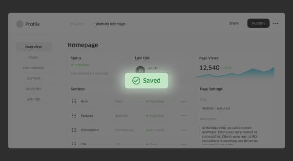
Back in the olden days, saving progress used to be a surprisingly emotional part of using a computer. (Video game memory cards too, but I’m still emotionally recovering from that one.) You constantly had to remember to manually save your progress, cross your fingers that the file saved correctly, pray nothing crashed before it finished saving, and hope you were exporting the right version in the right format. Losing work is a painful emotional peak that a lot of people remember experiencing.
Today, autosave has become so standard online that most users barely think about it at all. Now that’s incredible UX.
A huge amount of UX thoughtwork went into transforming what used to be a stressful interaction into something almost invisible. The experience quietly protects users in the background without demanding attention, which is exactly why it works so well.
And if we keep the Peak-End Rule in mind, it changes how we should think about attention within an experience. Not every interaction needs to be optimized to stand out or leave an emotional impression because some parts of an experience are simply there to help users move forward with ease, so the moments that matter can carry the emotional weight of the experience.
In those situations, invisible UX is probably the best UX.
The Gray Area
The tricky part is that it’s easy to categorize interactions in theory.
A password reset flow probably should not become a memorable emotional experience. But other interactions are far less obvious. A checkout flow for a $25 gift card probably works best when it disappears into the background entirely, while a checkout flow for $2,500 (a major financial decision) may actually benefit from reassurance, trust-building and moments of confidence.
That’s where this conversation starts becoming less about rigid rules and more about understanding context. The challenge is not deciding whether UX should be invisible or memorable, it’s identifying which moments deserve attention and which ones work best when they quietly stay out of the way.
TL;DR
If you’re wondering what makes an experience memorable — and if it even should be — consider the following:
- People don’t usually remember experiences flow by flow. They remember the moments that made them feel something.
- Peaks in an experience aren’t just positives, but can be negative, too.
- Not all experiences should stand out. A smooth experience is easy to overlook, but that’s the point.
- Both memorable and invisible UX require intentional design.
- The hard part is not deciding if UX should be invisible or memorable, it’s figuring out where each one belongs.
At the end of the day, UX is a balancing act between memory and invisibility. Some experiences become meaningful because they’re memorable and some become meaningful because people never have to think about them at all. And the experiences that feel the best are the ones designed with the difference in mind.

Comments
Add A Comment