From Sketch to Print: Bringing a Dead Idea Back to Life
As a designer, it’s my job to bring ideas to life. But for every great idea that makes it to production, dozens of other crazy-amazing ideas die.
Every creative has an idea graveyard. There’s a lot that gets left behind in revisions, and a lot that changes from Version_1.psd to Final_V9_for_real_this_time_v5.jpg. Most of the time, we shed a tear, say a few kind words and let these ideas rest in peace. But this time, we did something different. We went full-on Evil Dead and brought a great idea back from the grave.
Last year, we worked on a fundraising campaign for a nonprofit. The plan was to build excitement around donations by offering some swag for donors. We generated tons of ideas, all of which would have made amazing gifts for donors. But in the end, we could only choose one. We ended up producing a series of original photographs, and they were a hit. The campaign was a success, but there was one idea that just wouldn’t die.
The idea was to illustrate a series of original prints — ones that would bring a personal touch in to donors’ homes. We were all stoked on this campaign during concepting, and this one was special to me. Having started my career as a screen printer, I’ve had the opportunity to experience this process more times than I can remember, and I am always dying to get back to my roots.
At the end of the day, the illustrated prints just didn’t make the final cut. As I started to wrap up the project, Adam reached out to me and asked if I could make the illustrated prints a reality. I could get them out of my head and into my portfolio, and maybe we could have them at Nebo, just for ourselves.
To that I said shoot yeah, and started documenting the process along the way.
Step 1: Sketch It Out
Before doing anything in Illustrator I flesh everything out on paper first. I like to sketch most of my work on graph paper, as I feel like this gives me a good idea of shape, while the grid keeps things clean and organized. And, since this is a series of three illustrations, the grid structure helps keep the drawings uniform.

Step 2: Go Digital
Once the sketch is to where I like it, I go into Illustrator and get things cleaned up and colored. Simple shapes work the best for screenprinting. They give just enough detail to get the idea across, but not so much that things get overwhelming. Since this project was going to be translated as a screen print, I used limited colors and sharp shapes to help with registration.
Once the illustration is finalized, it’s important to do a good job of cleaning and getting the file ready for print. To prep for print, it helps to split colors on their own layers and use PMS colors that printers can reference.
Once the files are ready, they’re sent to the printer. I may be biased, but I always reach out to the crew at Danger Press. It’s where I cut my teeth early in my career, and they do great work.
Step 3: Head to the Shop
The shop is where the inks are mixed and each color is separated into its own print layer. Each screen has a positive printed onto a coat of emulsion that is exposed in a light box. Wherever the positive isn’t, the emulsion cures onto the screen. The printed positive film protects the emulsion from the light, and can be washed out to create a stencil of that layer’s color. After the screen is burned, washed and dried it moves to print.

Step 4: Line Things Up
When printing posters, it’s crucial to stay as close to perfect as possible. Registration marks are printed on the outside edges of the paper and are used to line up layers to each other. There is a vacuum inside the table of the press in order to keep things as still as possible. But that’s only one of the things to be watchful for while printing. It’s important to keep an eye on the prints the entire run to avoid inks drying in, squeegees having issues with pressure, ink running out or flooding issues.
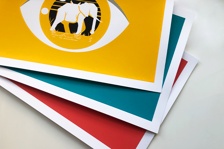
Step 5: Enjoy
Once the prints are pulled, dried and cut down, it’s time to sign and number each one before giving them a new home. In this case, we printed a series of three illustrations, at 100 prints each, and gave them away as gifts to the hardworking folks at Nebo.
The feeling of seeing my work translated from a computer screen to a print in someone’s hand is one that I always enjoy, and is always worth working toward. And in the end, I was lucky enough to work with two great organizations — our nonprofit client and Nebo — and experience it twice.
And the moral of the story is: if you have something in you that you need to see happen, go out and make it.

Comments
Add A CommentThese were amazing designs! I'm loving that were printed after the campaign direction shifted to photo prints.
our current web-site is fairly quickly growing to be certainly one of my top feature. So, I just stumbled on creative weblog and I just need to state that this amazing is a nice blog post. Bless you pertaining to this kind of knowledge.
Some genuinely choice content on this site, saved to favorites .
Your current web-site is fairly quickly growing to be certainly one of my top feature. So, I just stumbled on creative weblog and I just need to state that this amazing is a nice blog post. Bless you pertaining to this kind of knowledge.